Can anyone explain the difference between justify-items and justify-content in a grid?
Hi mate, it’s kinda tricky to explain but I’ll give it a go:
So, justify-items sets the horizontal alignment of items within their cells whereas justify-content sets it for the grid as a whole within its container
Hi, there!
I would just like to add some visuals to help explain the previous response.
We’ll look at this example:
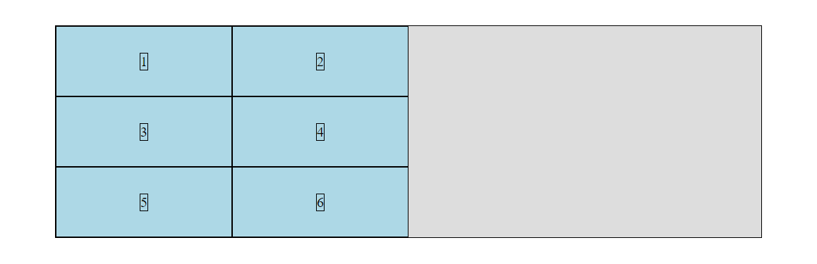
<div class="container">
  <div class="box"><span>1</span></div>
  <div class="box"><span>2</span></div>
  <div class="box"><span>3</span></div>
  <div class="box"><span>4</span></div>
  <div class="box"><span>5</span></div>
  <div class="box"><span>6</span></div>
</div>
.container {
  display: grid;
  grid-template-columns: repeat(2, 250px);
  grid-template-rows: repeat(3, 100px);
  width: 1000px;
  grid-template-areas:
    " one two"
    " three four"
    " five six ";
}
.box:nth-child(1) {
  grid-area: one;
}
.box:nth-child(2) {
  grid-area: two;
}
.box:nth-child(3) {
  grid-area: three;
}
.box:nth-child(4) {
  grid-area: four;
}
.box:nth-child(5) {
  grid-area: five;
}
.box:nth-child(6) {
  grid-area: six;
}
So, we have a grid container with two columns and three rows.
justify-content is applied to the container and controls the alignment of the grid columns. Let us apply space-around to the container:
.container {
  justify-content: space-around;
}

justify-items is applied to the container and controls the alignment of grid items within their column. Let us apply start to the container.
.container {
  justify-content: space-around;
  justify-items: start;
}
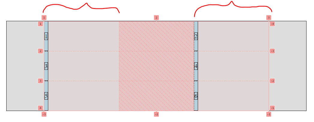
Here, we can still see that the columns are 250px in width, but the elements within the columns are aligned to the start and make the column appear “thinner.” Why is that? When start, center, or end is applied, the width of the grid items will be determined by the width of their children element (in this case, the span).
So, would align-items: stretch just put us back where we started? Why even have “stretch”?
Well, if you’re asking about align-items, that will position the grid items vertically within their columns. (Inevitably affecting their height)
But, stretch (for both align and justify items) is the default value. So, when you apply grid to a container, even without explicitly setting the style yourself, they are set to “stretch”
This topic was automatically closed 41 days after the last reply. New replies are no longer allowed.